Analytics for Ops: From Gut Feel to Dashboards
Why the floor needs numbers, not folklore
Every operation has a creation myth: a veteran manager with preternatural instincts who could “feel” a spike before it hit. Folklore is useful, but it doesn’t scale across sites, seasons, or new leaders. What scales is a small set of live signals that explain where work is forming and whether your current coverage can absorb it. With platforms like https://shifton.com/ that centralize schedules, time, and frontline activity, you can turn raw events—orders released, rooms cleaned, tickets accepted—into decisions a duty manager can make in under a minute. The goal isn’t big data; it’s clear data at the speed of the shift.

From noise to signal: deciding what to measure
Most teams drown in charts that don’t change behavior. The cure is a ruthless filter: only keep metrics that (1) a shift lead can influence today, and (2) predict an outcome customers feel. That usually means three families. First, demand curves by hour, drawn from order creation, bookings, footfall, or ticket intake. Second, capacity and cost, anchored in scheduled hours, live attendance, and overtime proximity. Third, service attainment, such as pickup-in-30, queue-under-five, first-response time, or first-pass yield. Together these tell a simple story: what’s coming at us, what we’ve deployed to meet it, and whether the promise was kept.
The anatomy of a trustworthy KPI
A great KPI is boringly specific. “Labor” is vague; “labor cost % by daypart in curbside handoffs” tells you exactly where to look. “Satisfaction” is mushy; “orders ready within 30 minutes” is a promise you can staff. “Throughput” is abstract; “units per labor hour in Zone B between 16:00–19:00” directs coaching to a place and time. Precision doesn’t mean complexity. It means the label matches the work and the unit matches the decision. If a number can’t prompt a move—add a micro-shift, pull a runner, delay a low-value task—then it belongs in a quarterly review, not on a shift dashboard.
Coverage, utilization, and the lies of “busy”
Ops teams conflate “busy” with “under-covered.” Coverage is the match between staffed capacity and workload at a given hour. Utilization is how much of that capacity is actually used. You can feel slammed with a labor curve that’s quietly peaking at the wrong time. That’s why plotting labor % by hour next to demand by hour is revelatory: managers see when they’re expensive and idle at 15:00, then threadbare and frantic at 17:30. When you also show SLA attainment on the same timeline, the fix becomes obvious—shift overlap, insert a 3–5-hour booster, or re-sequence tasks so a runner bridges the bottleneck instead of adding another cook to a mismanaged pass.
Dashboards people will actually use
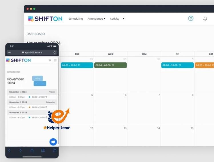
Pretty UI doesn’t rescue a bad model. Useful dashboards are shamelessly operational: one page, three sections, no scroll for the critical window. At the top, the now panel—current backlog, SLA risk, overtime risk—with a nudge (“add runner to bays 1–3” or “slide overlap 30 min”). In the middle, the hourly timeline for the rest of the day, because late decisions are expensive. At the bottom, yesterday’s post-mortem strip—the two or three spots where you missed the promise—so pre-shift huddles start with evidence, not anecdotes. When you wire these KPIs into a single reporting surface such as https://shifton.com/features/reporting-software, you stop playing dashboard roulette and give every manager the same cockpit.
Turning numbers into choreography
Great analytics don’t end with a chart; they provoke a move. When labor % spikes without demand, prune overlap or convert a static station to a micro-shift that rides the wave. When SLA dips while labor is low, you’re under-covered or mis-sequenced—insert a runner to connect staging and handoff, or move a scarce certification to the hot hour. When cost per shift rises and SLA still misses, throw away the “more bodies” reflex and fix process first: slot faster, prep earlier, queue smarter. The magic is speed; a redeployment made 90 minutes early prevents the 23:30 overtime everyone hates.
Why payroll integrity makes analytics believable
If the paycheck is wrong, your numbers are fiction. Analytics lose credibility when premiums, night differentials, and split shifts get “fixed on Friday.” The path to trust is dull but vital: time capture that reflects where work happened, approvals that flow daily, and automated rules that calculate pay the way policy reads. Once managers see that a change to the roster automatically shapes time and cost, they start believing the graph that tells them to add a 16:30–20:30 booster and tighten the 18:00 handoff. Doubt kills adoption; accurate payroll revives it.
Data hygiene: small, unglamorous wins with huge impact
Your best improvement per minute of effort is cleaning labels. Normalize job names so “Front Desk,” “Reception,” and “FD” aren’t three different worlds. Kill shadow spreadsheets that create version wars between “official” and “real” schedules. Tag special days—storms, promos, truck delays—so next year’s targets don’t punish you for outliers. Align time zones before you compare sites. These aren’t BI projects; they’re simple practices that convert muddle into comparisons you can act on. When the nouns are clean, the trends get honest.

Building the culture: analytics as a shared language
Numbers unite teams when everyone agrees on what they mean. That’s why great ops leaders teach a small vocabulary and repeat it until it becomes habit: “labor % by daypart,” “units per labor hour,” “SLA attainment,” “schedule stability.” They open the day with the same three charts and close it by annotating the two places they changed the plan. They coach with yesterday’s facts, not last quarter’s stories. Over time, this creates a quiet feedback loop: line leads flag a looming spike, supervisors adjust coverage, finance sees smoother costs, and customers experience steadier service. You don’t need a data scientist on every shift; you need a team that treats a chart like a shared checklist.
A short field story: the 17:00 illusion
A regional retailer kept missing curbside pickup promises 17:00–19:00. Managers insisted they were short-staffed; finance saw high labor % in the same window. The dashboard stitched the truth: orders spiked at 16:30, staging lagged, and runners were busy helping in-store. Age-check certifications were scheduled earlier, leaving the peak under-licensed. The fix didn’t require new hires: add a 16:30–20:30 runner micro-shift, move one cert to 17:00–21:00, shorten the 16:00 overlap and add one at 18:00. Two weeks later SLA was back above 90%, labor % flattened, and disputes dropped. Gut feel wasn’t wrong; it was imprecise. Analytics gave it edges.
Choosing restraint over “all the data”
The temptation in analytics is maximalism—track everything “just in case.” Resist it. Every extra widget is a tax on attention, and attention is scarce during a rush. Start with three-to-five metrics that map directly to actions your team will take this week. If a new chart doesn’t consistently prompt a move, archive it. The aim is a living instrument panel, not a museum. When you execute this discipline, dashboards become a force multiplier: they compress decision time, reduce argument, and turn disparate locations into a single operating system.
The payoff: calmer days, steadier promises
Analytics for ops is not about showing off charts; it’s about making fewer apologies. When demand curves, coverage, and promises live on one page—and when every number is tied to a move—you cut overtime, protect morale, and deliver service that feels consistent even on chaotic days. The frontline stops guessing, supervisors stop firefighting, and leaders stop debating anecdotes. Most importantly, customers feel the difference before finance reports it. That is the mark of analytics done right: not louder dashboards, but quieter operations that keep their word—shift after shift, site after site.


