5 Ecommerce Website Design Mistakes That Kill Sales
Ecommerce website design mistakes are among the most underestimated reasons why online businesses fail to achieve their true potential. Have you ever wondered why your store has thousands of visitors but only a handful of sales? Could it be that your design is silently driving customers away before they even reach the checkout?
The digital marketplace is fiercely competitive, and design flaws don’t just look unprofessional—they cost real money. A slow-loading page, a confusing layout, or a missing call-to-action can easily frustrate visitors. When frustration builds up, they don’t think twice before abandoning your site for a competitor. The harsh reality is that design mistakes kill trust, reduce engagement, and ultimately slash sales.
In this article, we’ll uncover the five most common pitfalls in e-commerce website design that silently drain your profits. More importantly, we’ll explore how fixing these mistakes can boost conversions, improve user satisfaction, and give your online store the competitive edge it needs. Whether you’re a seasoned entrepreneur or just starting your digital journey, understanding these errors will save you time, money, and missed opportunities.

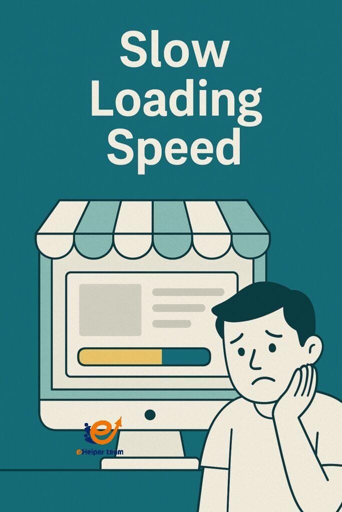
Slow Loading Speed: Why Speed Matters in E-commerce Design
1.Why loading speed is critical
Shoppers expect instant gratification. If your store takes longer than three seconds to load, studies show that nearly 40% of users will abandon it. Speed doesn’t just affect convenience; it directly impacts sales, trust, and search engine rankings. Google itself prioritizes fast websites in search results, meaning a slow site doesn’t just lose customers—it also loses visibility.
2.Common causes of slow loading
Oversized images and unoptimized media
Too many plugins or scripts running in the background
Cheap hosting servers with limited bandwidth
Lack of caching or content delivery networks (CDNs)
3.How slow speed impacts conversion rates
A slow store is like a cashier who takes forever to ring up your items. Customers leave frustrated, often never to return. In fact, Amazon once reported that every one-second delay in loading cost them millions in sales. While smaller businesses may not lose millions, the percentage loss is just as significant.
Confusing Navigation: Losing Customers Before Checkout
1.The hidden cost of poor navigation
Imagine walking into a supermarket where items are scattered randomly. Would you stay or leave? Poor navigation in e-commerce works the same way. If customers can’t find what they’re looking for quickly, they’ll click away.
2.Signs your navigation is confusing
Too many menu options without clear categories
Missing search functionality
Nested menus that make browsing frustrating
No breadcrumb trails for orientation
3.Best practices to streamline user journeys
Keep menus simple and intuitive
Use descriptive labels, not jargon
Highlight popular categories and best sellers
Ensure a powerful search bar is visible on every page
By guiding customers smoothly, you reduce friction and keep them focused on purchasing instead of getting lost.
Poor Mobile Experience: Missing Out on Mobile Shoppers
Why mobile-first design matters
More than 60% of online shopping happens on smartphones. If your website isn’t optimized for mobile, you’re ignoring the majority of your audience. A poor mobile experience doesn’t just cost sales; it damages your brand reputation.
Responsive vs adaptive design
Responsive design automatically adjusts layout and content to fit any screen size, while adaptive design offers preset layouts for different devices. Both approaches are effective, but responsive design is often the most practical for e-commerce.
Consequences of ignoring mobile users
Difficult-to-read product descriptions
Buttons that are too small for fingers
Broken layouts causing mistrust
Higher bounce rates due to frustration
A mobile-friendly site doesn’t just improve usability—it builds credibility with modern shoppers.
Lack of Clear Call-To-Action (CTA): Guiding Customers to Convert
Why CTAs are essential
Without a clear CTA, customers feel lost. Should they “Buy Now”? “Sign Up”? Or “Learn More”? The absence of direction makes users hesitate, and hesitation kills conversions.
What makes a CTA effective
Action-driven words like “Shop Now” or “Get Started”
Contrasting colors that stand out against the background
Strategic placement above the fold and at checkout pages
Placement, color, and wording tips
Use larger, bold buttons for primary actions
Place CTAs in product pages, checkout, and even blog content
Avoid vague words like “Click Here”—be specific
When CTAs are clear, customers move forward effortlessly, boosting both sales and user experience.
Overlooking Integration with Business Strategy
The missing link between design and monetization
Many entrepreneurs assume design ends at aesthetics. In reality, design must work hand in hand with marketing and monetization strategies. A beautiful store without business integration is like a showroom without sales staff.
Example: dropshipping business model
Modern businesses often integrate e-commerce design with models like dropshipping. This allows them to scale without stocking inventory. If your design doesn’t support simple product imports, flexible payment gateways, or smooth checkout for dropshipping, you risk losing growth opportunities.
For practical steps, check our related guide on starting a dropshipping business and how design decisions directly impact long-term profitability.
Mistakes vs. Solutions
| Mistake | Impact on Sales | Solution |
|---|---|---|
| Slow loading speed | High bounce rate | Optimize images, use CDN, upgrade hosting |
| Confusing navigation | Abandoned carts | Simplify menus, add strong search function |
| Poor mobile experience | Lost mobile users | Responsive design, mobile-first approach |
| Weak or missing CTAs | Low conversions | Clear, bold, and action-oriented CTAs |
| Lack of integration strategy | Stagnant growth | Align design with business models & funnels |
Real-World Case Study
Consider an online fashion boutique that struggled with a 70% cart abandonment rate. After conducting an audit, they found three major issues: slow product images, unclear navigation, and missing CTAs. By compressing images, simplifying the menu, and adding bold “Buy Now” buttons, their conversion rate increased by 45% in just three months. This proves that fixing design mistakes isn’t just theory—it directly translates into higher profits.

Frequently Asked Questions (FAQs)
1. What’s the fastest way to fix slow-loading pages?
The quickest solutions include compressing images, reducing unused scripts, and using a content delivery network (CDN).
2. How do I create navigation that customers love?
Keep categories simple, add a search bar, and ensure customers can find products in under three clicks.
3. Is mobile design more important than desktop design?
Yes, since mobile traffic exceeds desktop, you should adopt a mobile-first approach without ignoring desktop usability.
4. What’s the role of CTAs in increasing sales?
CTAs act as signposts that guide customers to complete desired actions like buying, signing up, or exploring more.
5. How do I connect my design to my business strategy?
Start by ensuring your store supports modern business models such as dropshipping, affiliate links, and email marketing funnels.
Conclusion
E-commerce success isn’t just about having great products—it’s about creating a seamless online shopping experience that builds trust and drives conversions. As we’ve seen, ecommerce website design mistakes like slow loading speed, confusing navigation, poor mobile optimization, and unclear CTAs can silently drain your profits without you even noticing. The good news? Each of these mistakes can be fixed with thoughtful design choices and a clear strategy.
When you optimize speed, simplify navigation, design for mobile-first, and highlight powerful CTAs, you remove friction from the customer journey. Pair that with a design that aligns with your business model—whether it’s traditional e-commerce or a dropshipping business—and you’ll set your store up for long-term growth.


