How to Design YouTube Thumbnail – Beginner’s Canva Guide for High CTR
When was the last time you thought deeply about your video’s thumbnail before hitting publish? For many creators, learning how to design youtube thumbnail is an afterthought, yet it’s one of the most critical elements in determining whether your content gets clicked—or gets lost in the sea of videos.
Think about it: you could spend hours perfecting your script, filming, and editing, but if your thumbnail doesn’t grab attention in under two seconds, viewers might scroll right past it. Your thumbnail acts as the visual “first impression” of your video, and in an age where attention spans are shrinking, that first impression is everything.
In this guide, we’ll break down how to design YouTube thumbnails that achieve a high click-through rate (CTR), using proven thumbnail best practices, smart color psychology, and Canva thumbnail templates to create designs that stop the scroll. By the end, you’ll know exactly how to craft thumbnails that not only look professional but also encourage clicks, increase watch time, and boost your overall YouTube growth.

Why Thumbnails Matter More Than Ever
1. Thumbnails as Your 24/7 Salesperson
Your thumbnail is like a salesperson working for you around the clock. A well-designed thumbnail can boost CTR dramatically, leading to more organic reach.
2. The CTR-SEO Connection
YouTube’s algorithm rewards videos that have a higher-than-average CTR for their category. This means a high click-through rate thumbnail can directly impact your search rankings.
3. Brand Recognition Through Visuals
Consistent style in thumbnails builds brand recognition. Audiences begin to recognize your content instantly in the recommendations feed.
The Core Elements of a High-CTR YouTube Thumbnail
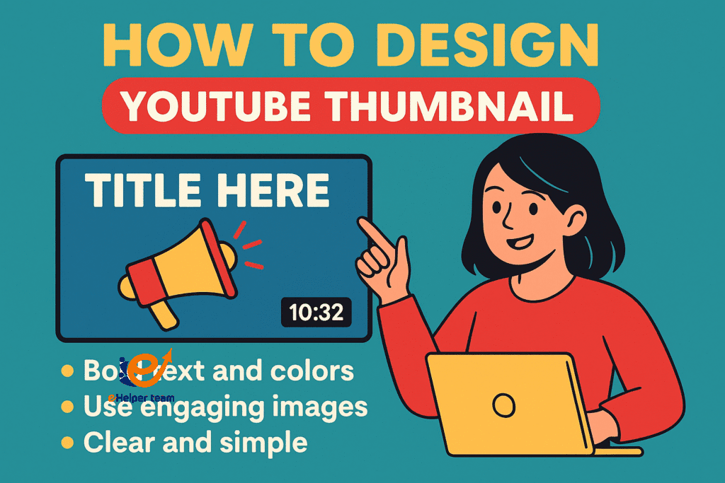
1. Using Bold Text and Faces
Research shows that thumbnails featuring expressive human faces can increase CTR by up to 30%. Combine this with short, bold text that highlights the video’s value.
2. Leveraging Color Psychology
Colors trigger emotional responses. For instance:
Red and yellow create urgency
Blue conveys trust
Green signals growth and positivity
Choosing the right palette can subconsciously influence clicks.
3. Simplicity Wins
Cluttered thumbnails overwhelm the viewer. Stick to a maximum of three visual elements: background, subject, and text overlay.
How to Design YouTube Thumbnail with Canva
Canva is a beginner-friendly design tool offering Canva thumbnail templates that save time while maintaining professional quality.
Step-by-Step Process:
Choose the Right Dimensions
YouTube recommends 1280×720 pixels for optimal display.Pick a High-Quality Background Image
Use an image that reflects the main topic of your video.Add Bold, Readable Text
Keep it short—3–5 words max.Incorporate Your Branding
Add a small logo or consistent corner element.Export in PNG for Best Quality
Color Psychology in Thumbnails
| Color | Emotion Triggered | Best Used For |
|---|---|---|
| Red | Urgency, passion | Tutorials, trending news |
| Blue | Trust, calmness | Educational, corporate |
| Yellow | Energy, optimism | Lifestyle, vlogs |
| Green | Growth, nature | Finance, health |
Understanding color psychology allows you to craft designs that resonate emotionally with your target audience.
Thumbnail Best Practices Backed by Data
Test Different Versions using A/B testing tools in YouTube Studio.
Avoid Clickbait—misleading images may boost initial clicks but hurt retention.
Use Faces with Eye Contact to connect with the viewer.
Contrast Your Colors to make text and subjects pop.
Case Study – The 5% CTR Boost in One Week
A small lifestyle channel redesigned its old thumbnails using bold text, brighter colors, and close-up faces. Within one week, the CTR increased from 4.2% to 9.5%, resulting in a 47% boost in overall views. This quick change, combined with strategies from free 1000 subscribers on YouTube, accelerated channel growth significantly.
Common Thumbnail Mistakes to Avoid
Too much text
Poor contrast between text and background
Overuse of stock images that don’t match the content
Low-resolution images that appear blurry
Advanced Tips for Designing Thumbnails
1. Use the Rule of Thirds
Position key elements at intersecting points to naturally draw the viewer’s eye.
2. Keep the Subject on the Right Side
This leaves room for YouTube’s time stamp, ensuring important visuals aren’t covered.
3. Optimize for Mobile
Since over 70% of YouTube views happen on mobile, make sure your text and subject are visible at small sizes.
Integrating Thumbnails into a Bigger SEO Strategy
A thumbnail alone won’t guarantee success—it needs to work with your title, description, and tags. Using guides like AI apps for photo edit can also help enhance your images before upload.
Before the FAQs – Cross-Platform Growth
Promoting your YouTube content on other social platforms can amplify its reach. Expert strategies in growing other platforms with TikTok show how a single well-designed thumbnail can grab attention across multiple channels.
Testing and Iteration – The Secret to Long-Term Thumbnail Success
Even if you already know how to design youtube thumbnail that follows best practices, the real magic happens when you test and refine over time. A thumbnail that works well for one audience might not perform as strongly for another.
A/B Testing Your Thumbnails
Create Two Variations: Change just one major element (e.g., background color, text placement) so you can measure the impact accurately.
Run the Test for at Least a Week: This gives enough time for YouTube’s algorithm to collect meaningful data.
Check the CTR and Watch Time: A thumbnail with a higher CTR but lower watch time might be misleading viewers, so aim for a balance.
The Role of Emotional Triggers in Thumbnails
Emotions drive clicks. When designing your thumbnail, think about the reaction you want from the viewer: excitement, curiosity, urgency, or even surprise.
Curiosity Gap: Use an image that hints at the video’s content but doesn’t reveal everything.
Fear of Missing Out (FOMO): Combine powerful phrases like “Last Chance” or “Don’t Miss This” with an urgent color palette.
Achievement and Pride: Great for tutorial and how-to videos—show a clear “before” and “after” image.
Consistency in Style – Building a Visual Brand
When your audience can instantly recognize your videos in the recommendations feed, you’ve achieved a strong visual brand. To do this:
Use a consistent color palette across all thumbnails.
Keep font styles uniform.
Maintain a predictable layout (e.g., subject on the right, text on the left).
This consistency not only improves CTR but also builds trust with your audience.
Leveraging Analytics for Thumbnail Optimization
YouTube Studio offers detailed analytics that can guide your thumbnail design decisions:
CTR Trends Over Time: Identify which styles of thumbnails perform best.
Audience Demographics: Colors and styles may need to adapt based on your target audience’s age and preferences.
Traffic Sources: See if certain thumbnails perform better in “Suggested Videos” versus “Search Results.”
By combining analytics with your how to design youtube thumbnail process, you can create designs that are data-driven rather than guesswork.
Outsourcing Thumbnail Design – When to Consider It
If you’re producing a high volume of videos or want ultra-polished results, outsourcing thumbnail design can be worth the investment.
Freelancers on Platforms like Fiverr or Upwork can deliver custom designs for a reasonable price.
Dedicated Design Services specialize in YouTube branding and can create cohesive styles for your channel.
Outsourcing allows you to focus more on content creation while ensuring your thumbnails remain high quality.
Designing Thumbnails for Different Video Types
Not every video calls for the same thumbnail style. Tailoring your design based on the content type can dramatically improve CTR.
Tutorials and How-To Videos
Use clear step visuals or “before and after” images.
Add text that promises a specific outcome, like “Edit Videos Faster” or “Grow Your Channel in 7 Days.”
Reviews and Unboxings
Show the product prominently with bold, contrasting colors.
Highlight a key feature or your reaction for added emotional impact.
Vlogs and Lifestyle Content
Focus on vibrant, relatable imagery that reflects the mood of the video.
Use softer, inviting colors to create connection rather than urgency.
Accessibility Considerations in Thumbnail Design
A truly high-performing thumbnail is one that’s accessible to all viewers. When thinking about how to design youtube thumbnail, remember:
Color Blindness: Avoid relying solely on color contrast—use bold shapes and outlines.
Readable Fonts: Choose sans-serif fonts that remain legible even at small sizes.
Clear Visual Hierarchy: Make sure the main subject stands out regardless of the device.
Using Seasonal and Trend-Based Thumbnails
Aligning your thumbnails with seasons, holidays, or trending topics can make them more relevant and clickable.
For example, during the holiday season, add subtle festive elements like snowflakes or red-green accents.
Tie into cultural events or trending hashtags, but ensure it’s still relevant to your content.
The Psychology of “Faces” in Thumbnails
Human faces are powerful attention magnets. Eye-tracking studies show that viewers are naturally drawn to faces, especially those showing strong emotions.
Direct Eye Contact: Creates a sense of personal connection.
Exaggerated Expressions: Surprise, excitement, or concern can increase curiosity.
Faces as Storytelling Tools: Pair an expressive face with a suggestive background to build intrigue.
Creating Thumbnails That Stand Out in Suggested Videos
When your video appears alongside dozens of others in the Suggested feed, your thumbnail needs to compete for attention:
Use high-contrast backgrounds to make the subject pop.
Incorporate an unusual element—a striking prop, unexpected color choice, or playful composition.
Keep the design clean so it remains clear even in smaller preview sizes.
Repurposing Thumbnails for Other Platforms
A strong thumbnail can serve as promotional material beyond YouTube.
Use the design as a social media teaser on Instagram, TikTok, or Facebook.
Adapt the layout for vertical formats in Stories or Reels.
Maintain consistent branding so your audience can instantly recognize your content across platforms.\

FAQs – How to Design YouTube Thumbnail
Q1: What’s the ideal size for a YouTube thumbnail?
1280×720 pixels with a 16:9 aspect ratio.
Q2: Can I design thumbnails for free?
Yes, Canva offers free templates perfect for beginners.
Q3: Should I include my face in thumbnails?
Yes, expressive faces can significantly boost CTR.
Q4: How much text should I use?
Keep it under 5 words for maximum impact.
Q5: Do colors really affect CTR?
Yes, strategic use of colors can subconsciously influence viewer clicks.
Conclusion
Mastering how to design youtube thumbnail is about far more than making something that “looks nice.” Your thumbnail is a strategic marketing tool—a visual promise to the viewer about the value they’ll get from watching your video, By applying design fundamentals, leveraging color psychology, using Canva’s versatile templates, and adapting your style to different content types, you create an entry point that demands attention.


